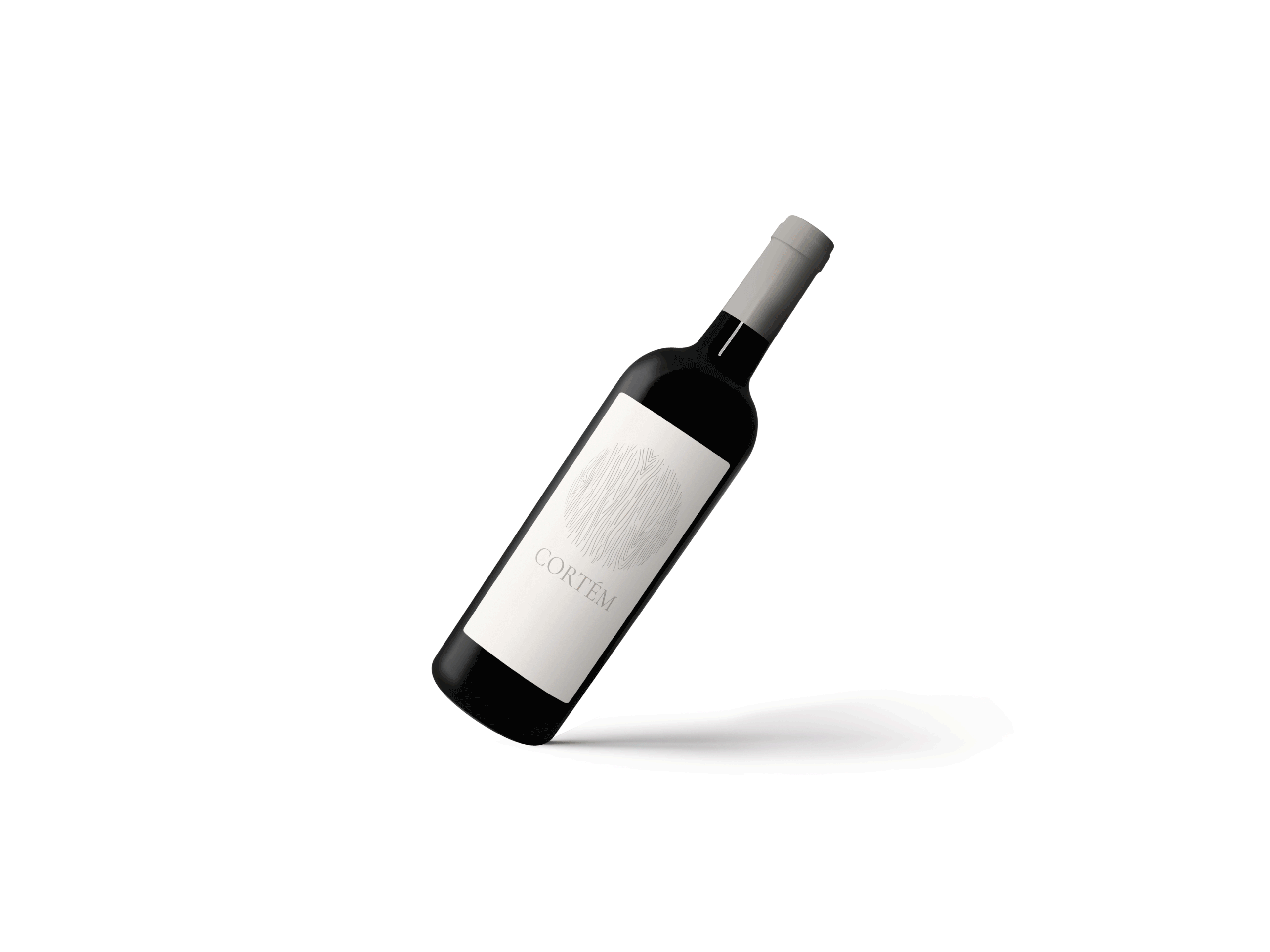
Vinhos Cortém is a local Portuguese Winery who was looking to change its brand identity in order to be perceived as premium, classic and traditional. For that, the challenge was to use their Adega and its elements as an inspiration.
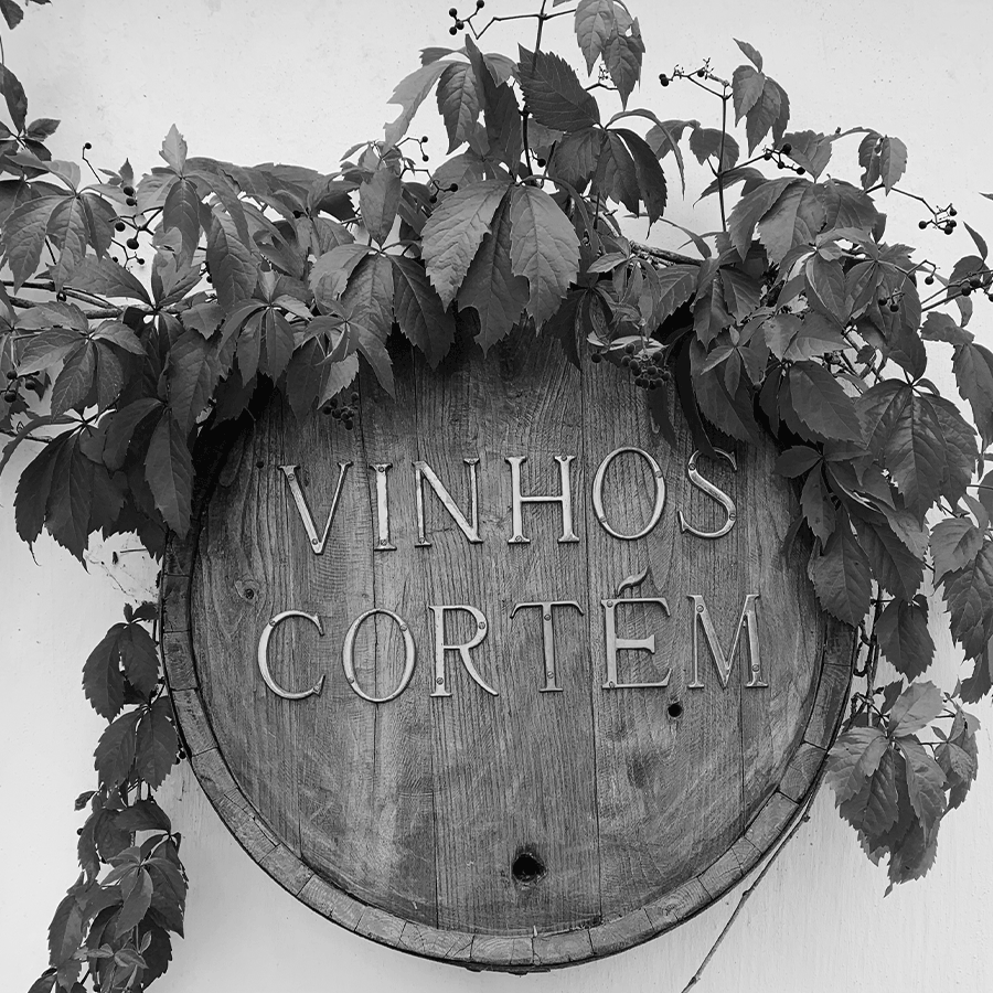
Inspired by the traditional wine barrel
used in the entrance sign of the adega, I
developed a concept by using the wood
marks, resembling a fingerprint, so the new
identity shows the brand's tradition, but
also passes on the idea of a unique wine.

The brand also wants to reduce its offer to a range of 5 wines. This way,
I created a soft, classic and elegant color pallete, one color for each different wine.